

Snapshot
Yearly return and volatility across assets.
Built with NumPy, Pandas, Matplotlib and yfinance.
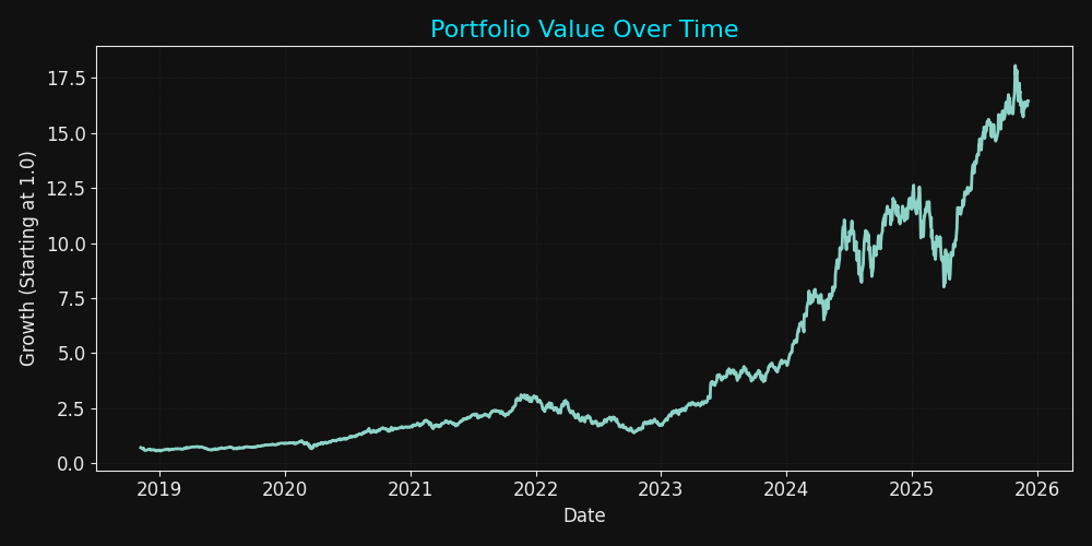
Portfolio Growth Curve
Visual Outputs
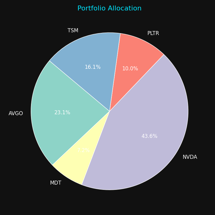
Asset Allocation
Distribution of assets displayed with a pie-chart breakdown.
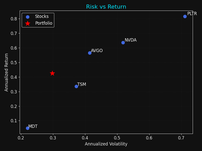
Risk vs. Return
Annualised volatility vs. expected return for each asset and portfolio.
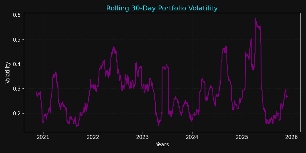
Rolling Volatility
30-day rolling volatility highlights periods of elevated market stress.
Methodology
1. Data Gathering
Uses yfinance to download adjusted closing prices for a set of tickers,
put into a price matrix.
2. Return & Covariance Model
Computes daily returns, annualises mean and volatility. Then constructs a covariance matrix to show relationships between assets.
3. Portfolio Construction
Applies user-defined weights to derive portfolio-level return, risk and Sharpe ratio. Then visualises key outputs in plots seen.